
|
Cheesecakeand The Art of the Pin-upThe Playboy Erapin-up n. |
|
In 1960, after Esquire gave up the use of nudity, the Varga Girl moved to Playboy where she was known as the Vargas Girl. About a decade later, when Penthouse appeared to rival Playboy, Playboy responded with a new magazine 'Oui', derived from the French magazine L'ui. Oui tried for a more avant garde European style. Oui's equivalent of the Vargas's pin-ups were created by Aslan, whose art continued the stylistic trend towards and beyond realism. While Messrs. Petty and Vargas kept both the romanticism of the early softer pin-up style, and a hint of the cartoonish style of the early Esquire work, Aslan went for a starker realism, a sharp, glossier style. Aslan started his career as a sculptor and so he was well equipped for to next the next step towards super-realism, and his earlier pin-ups follow the Petty->Vargas trend, glossier, hyper-real pictures of pretty girls with a sly humor to them. But, perhaps due to the trend towards explicitness that Penthouse fueled, his later pin-ups, however, become both more sexually explicit and colder, sacrificing both the heart and humor of his predecessors.
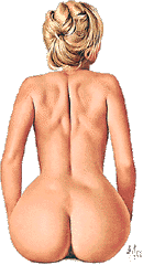 Aslan's subjects tended to be "mod" girls of the 60's and 70's, young
with an adolescent style, whereas the Varga and Petty girls had seemed
older and more sophisticated. This change in models was also reflected
in Vargas's later work at Playboy. To my eye, Vargas's mod sixties girls
were his least successful work. It was as if he could see the look and
the fashions of the sixties and dress his models up in them, but could
never capture the heart and feel of the day. Aslan, on the other hand,
captured the attitude as well as the look of the sixties which made his
work look contemporary and authentic.
 Aslan's work was and is quite popular. The youth and authenticity along
with his technical skill account for a lot of that, but so does the
sexually explicitness of his work. As with much of the material in
Penthouse, whose audience Oui was aimed at, Aslan's later work was much
more explicit than Vargas's or anything that would appear in Playboy. As
such, I don't consider a lot of Aslan's work as "cheesecake" as defined
above. Cheesecake should be provocative, its sexuality more suggested
and implied than explicit.
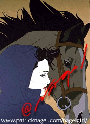
Vargas left Playboy and was followed by a number of artists, none of whom became as integral a part of the book as he had been. Two do stand out, though: Patrick Nagel and Olivia De Berardinis, both artists who combine a classical and a modern look.
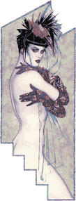
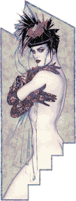
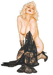
Nagel's style owes something to the art nouveau and art deco poster styles of the 1920's, and to Japanese woodblocks. His work is very sharp and stylistic, line art with colored shapes, the sort of thing which has been regarded as modern or futuristic for seventy years or so. Some of these same influences can be seen in Olivia's work as well. Note, for instance, the two supporters for the title at the top of page 1 of this essay.
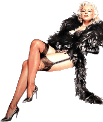
 Olivia De Berardinis, who
was a great fan of Mr. Vargas, was billed as his successor when she
first appeared in Playboy. Her style continued the trend to a slicker
more super-realist look, but retains some of the heart and romance of
the earlier years. To my eye she seems to have been influenced not only
by Petty's and Vargas's work, but by the Frank
Frazetta/Boris Vallejo school of paperback cover
illustration, which is both very slick and super-realistic. Neither
Frazetta nor Boris can be considered a pin-up or cheesecake artist, but
their cover illustrations often feature scantily clad or naked women.
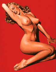
 Another artist who followed the path taken by Aslan, is the Japanese
artist Hajime Sorayama, who is
known both for his erotica and pin-up art and for his robots. The glossy
hard edge of his robot works seem to affect his entire style, and while
there is can be passion to some of his work than say Aslan's, the
super-realistic style is even more extreme. This can be seen by
comparing his painting of Marilyn Monroe to the right, with Olivia's
portrait of Rhonda Ridley above.
I originally referred to Olivia's picture as being of Marilyn. I recently realized that it is actually Rhonda Ridley, who only somewhat resembles Marilyn, but whom Olivia often portrays as an incarnation of her. Upon reconsideration, I still think that Olivia's picture of Rhonda as Marilyn captures Marilyn better than Sorayama's picture of Marilyn herself, which is quite telling.
Olivia's style is somewhere between the romanticism of Messrs. Petty and Vargas and the super-realism of Frazetta or Boris. Sorayama's is sharp and stylish bordering on the glossiness of his robot pictures. Her look is probably more appropriate for Marilyn, whose own style depended not only on stylish polish, but on the softness of her vulnerability.
|
|
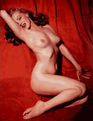
| Tom Kelley | Hajime Sorayama |
Another useful comparison is between Marilyn's Playboy centerfold and Sorayama's version of it. Here's a side-by-side (and an animation below, if your browser supports QuickTime objects) comparison of Hajime Sorayama's portrait of Marilyn and the original Kelley photo that it was based on.
Note how much sharper the edges are in Sorayama's drawing than in the actual photo. Also, amusingly enough, he has augmented Marilyn's measurements. He has made her breasts larger and fuller than reality. He has slimmed her waist, narrowed her hips, thinned her thighs, and lengthened her calves substantially.
That he felt he needed to exaggerate one of the most famous pictures of one of the most famous sex symbols in history is rather revealing. That he has made her rib cage stand out so much more distinctly, as if she were undernourished is, given the problems with anorexia and bulimia that plague our culture, tragic.
To my eye at least, the actual photo of Marilyn is much more appealing than Sorayama's version. By attempting to exceed reality he has created something a little colder than reality. He's left out the mystery and romance, the heart that is so important to the beauty of women such as Marilyn or Bettie, or to the "girls next door" that they are the idealization of.
So far, the artists I've covered have shown a continuing trend from the soft focus and romantic style of the early artists and illustrators to an ever-sharper look, moving through realism and beyond. The next chapter starts with an artist who reverses the trend as a comic book artist spearheads the a nostalgic trend back to the icons of an earlier time.
Brons
All Rights Reserved.The pictures used to illustrate the styles and artists reviewed here are all copyrighted by their respective creators (or their estates) or publishers and are used without explicit permission. I've done what I can to keep that use within the definitions of fair use.