
|
Latest Update June 6, 1998 Latest version: 1.8 Updated for 1.8 and Mac OS8 |
|
NEW!!: See also: |
The Nerd Corner

Eldacur Anteak for Kaleidoscope
 Eldacur Anteak is a Kaleidoscope color scheme for the Macintosh. Kaleidoscope is a Macintosh extension, developed by Greg Landweber, which allows you to change the appearance of windows and icons on your Macintosh. While Kaleidoscope can change the colors, decorations and even the shape of windows as well as the icons used for the folders and other system elements on the Mac, Anteak changes only the color and decorations.
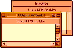
The picture to the right shows a typical Macintosh Finder window as rendered by Eldacur Anteak. As you can see, the colors are warm earth-tones and the window decorations are kept rather simple. Both the colors and simplicity are due to a combination of human factors principles and my own aesthetic preferences.
The version of Anteak available here is my very first completed Kaleidoscope scheme. If you have any problems with it, please let me know. I'm using Anteak myself on my PowerBook 5300ce, and I want it to be as good as it possibly can.
Download Eldacur Anteak
To use Eldacur Anteak, you must have at least version 1.5 of Greg Landweber's Kaleidoscope. You can read about or download Kaleidoscope from Greg's Web page.
The History and Theory of Eldacur Anteak
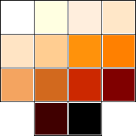 Anteak is the latest incarnation of a color scheme that I first developed several years ago and which I have used on X-Windows and Windows NT as well as on Macintoshes. When I was working on Multia at DEC, I used the immediate precursor of Anteak on a combination of both Motif and NT. The NT portion of that color map is shown in the fourteen squares to the right. The exact colors may or may not display correctly on your screen, depending upon what type of computer you have and which browser you are using. I know it isn't the same on my Mac as it was on my Multia, using the exact same monitor. The GIF does come moderately close, though.
I started to create this series of color schemes when I got my first color workstation. I was working in a software human factors group at the time, so I tried to set it up with a set of colors that would be easy to read, and easy on the eyes. There have been a number of studies that showed that the easiest text to read was printed on yellowish or greenish paper with an ink that wasn't completely black. This, perhaps coincidentally, matches the old-fashioned way of writing: in very dark brown ink (like burnt umber) on parchment. This appealed to me, so I created a color scheme that tried to emulate parchment and ink.
If the window background were going to be based on parchment and ink, then it seemed to me that the window frames should be based on various hardwoods like a real desk of the time, so I used a dark wood color (walnut, mahogany, and redwood) for the active window and paler woods (like oak, maple or teak) for all other windows. I toyed briefly with a green desktop mimicking the green felt of old desk blotters, but discarded the idea.
Over the years the exact colors have varied with the capabilities of my computers, the vagaries of my own personal taste and whimsy, and the criticisms of my colleagues. About the only color that has stayed constant through all these years is the ink color which has always been a very dark (about 25%) red. This color is the dark brown on the left side of the bottom row of the NT colors shown above.
Eldacur Anteak
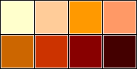 My earliest color sets tended to be a little bit greener than actual parchment (or manilla envelopes which I also used as a guideline). My latest sets have tended to be a bit redder than the parchments and woods. In fact, while the initial models for the colors were parchment, ink and wood, I stopped trying to really simulate them years ago. At this point, I am more concerned with a pleasing look and ease of reading. The eight colors shown to the right are the ones I've used in Anteak. I derived them by converting the 14 NT colors to the Macintosh system palette and then casting out duplicates.
The simplicity of the various window details, such as the close and zoom boxes comes from three sources. Foremost is the judgement that interfaces should be simple so as to not be intrusive. Beyond that, my personal tastes are for clean elegant designs. Finally, the vast majority of Kaleidoscope schemes seem to be very dark or very bright saturated colors with very busy glossy details. I've always tended to deliberately head off in uncommon directions.
The name Anteak, of course, comes from punning off of antique and teak, in honor of the scheme's heritage of emulating old-fashioned technologies and using wood models for many of the colors. It's also a made-up word and so not likely to have been used by anyone else. The origins of the word Eldacur are described on my Eldacur Technologies page.
Other People's Schemes
There are zillions of Kaleidoscope schemes out there. Many I find are too dark or too saturated or too busy, but there are quite a few very good schemes as well. Here are examples of a few of my favorites.Copperplate
by Gandolf a ka Brian Douglas Hagler
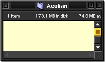
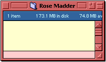
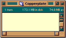 Copperplate is one of Gandolf's three "Optic Nerve Friendly" (ONF) color schemes and my favorite among them. Gandolf's basic design theory is much like mine. Schemes should be easy on the eye since you're going to be looking at them, or more properly at the content that they frame, day in and day out. His schemes tend to have more color contrast than mine -- copper plate is tan and green (copper and verdigris) and Rose Madder is blue and raspberry -- but I find them quite useable.
Gandolf's other schemes are Aeolian and Rose Madder.
Croesus
by Richard Bensam
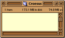 The basic color of the Croesus scheme is similar to Copperplate's, but the accent color is complementary rather than contrasting. If anything, this makes Croesus even easier on the eyes than Copperplate, though perhaps a bit less visually interesting. Richard makes up for this by the design of the window decorations and widgets. They're a bit more stylish and have some very nice animation.
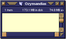
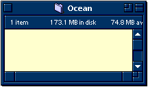
Richard's other schemes are Ozymandias and Ocean
Scrollites
by Layne Karkruff
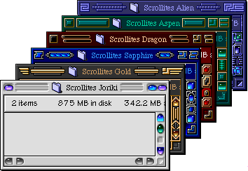 My favorite of Layne's Scrollite schemes is Scrollite Dragon, a collaboration between Layne and Richard Bensam. A comparison of Richard's Ozymandias scheme with Layne's Scrollites Gold shows up why the two are natural collaborators.
Dragon is a little dark and all the Scrollites a little busy, but they are done with such flair and artistry that I use the ruddy brown Dragon, along with Copperplate and Croesus as alternatives to my own Anteak.
Brons
Updated: Tuesday, July 15, 2008
|| Brons's Home Page | The Nerd's Corner Index ||